
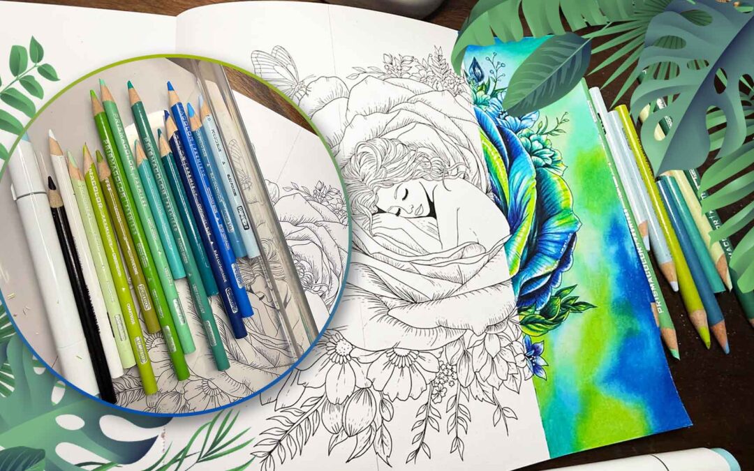
The Surprising History Behind Two of our Favorite Colors
BLUE — A COLOR ONCE WORTH A FORTUNE
One of the best places to begin is ancient Egypt. Egyptian blue is generally regarded as the earliest synthetic pigment: a color deliberately manufactured rather than simply ground from a naturally blue stone. Evidence places its production around the beginning of the third millennium BCE. It was made by heating a carefully balanced mixture containing silica, copper, calcium and an alkali.
COLOR FACT
Egyptian blue was not simply found in nature. Ancient makers engineered it, thousands of years before modern tubes of paint, markers or colored pencils existed.
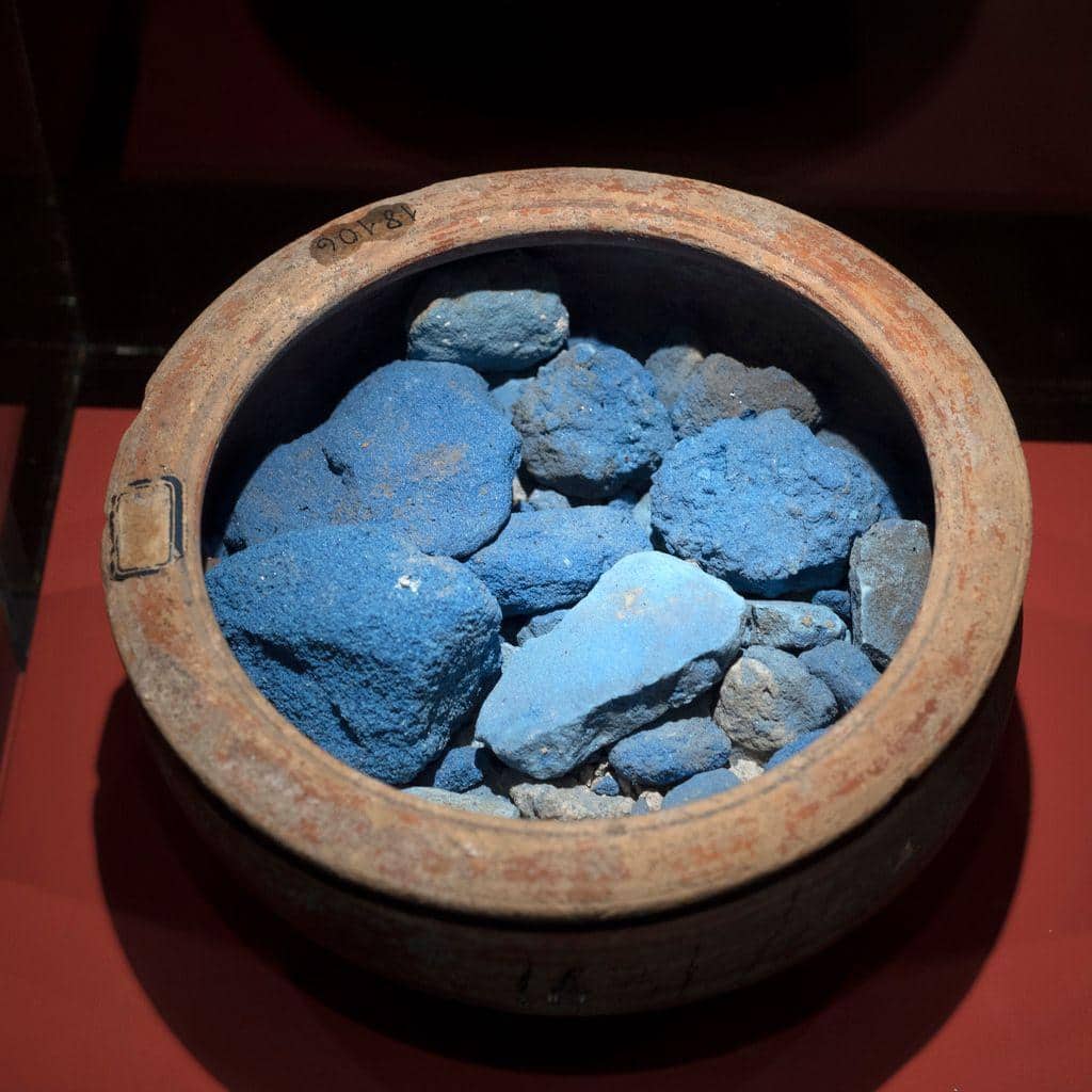
Egyptian Blue pigment — visually shows that blue existed as a manufactured pigment thousands of years ago. Harvard notes Egyptian blue was being made around 3100 BCE.
Even more remarkable, the pigment has survived on ancient objects for thousands of years. Modern researchers are still studying Egyptian blue, including a curious property invisible to our eyes: under the right conditions, it can emit near-infrared light.
From a Stone in Afghanistan to the Artist’s Palette
Another blue has an even more dramatic story: ultramarine. Natural ultramarine was made from lapis lazuli, the intense blue semi-precious stone historically mined in Afghanistan. Getting a beautiful blue pigment from the stone was labor-intensive, and the material had to travel enormous distances before reaching many European workshops.
During the Middle Ages and Renaissance, natural ultramarine became one of the most celebrated blues available to painters. Its rarity, difficult preparation and long journey made it exceptionally expensive. This is the idea behind my phrase “Blue Was Gold”: not that every blue pigment literally cost more than gold, but that the finest blue could be treated as a precious luxury material.
COLOR FACT
The name ultramarine comes from the medieval Latin ultramarinus — “beyond the sea” — a reference to the pigment’s distant origin.
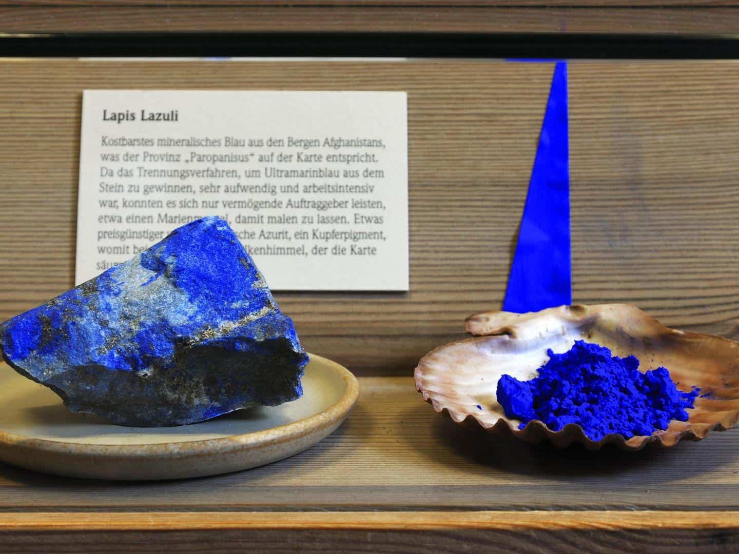
Lapis lazuli + ultramarine pigment — probably the most important image after your own artwork. It visually explains how an extraordinary blue came from stone mined in Afghanistan; the National Gallery describes ultramarine as the brilliant, stable blue derived from lapis lazuli and explains that its name meant “beyond the sea.”
For centuries, artists wanted the beauty of ultramarine without the enormous expense. In the nineteenth century, chemistry finally changed the story. Jean-Baptiste Guimet developed an artificial ultramarine process in the 1820s, and Christian Gmelin published a process in 1828. A color once dependent on a rare stone could now be produced far more affordably.
GREEN — BEAUTIFUL, NATURAL… AND SOMETIMES DEADLY
Green followed a different path. Early artists could obtain green from naturally occurring materials such as green earth and malachite, a copper mineral. Other historic greens, including verdigris, were made from copper compounds. But producing a bright, stable and affordable green was not always simple.
The green side of the history of blue and green colors takes us in a very different, and sometimes dangerous, direction.
Then eighteenth-century chemistry produced a green that was vivid, fashionable and dangerous.
The Color That Could Decorate a Room — and Poison It
In 1775, Swedish chemist Carl Wilhelm Scheele developed the pigment that became known as Scheele’s Green. Made with copper and arsenic, it offered a strong green that was inexpensive and resisted fading better than many alternatives. It became popular in the nineteenth century, including in printed wallpapers.
THE CATCH?
Scheele’s Green contained arsenic. Beauty and toxicity were sitting in the same pigment.
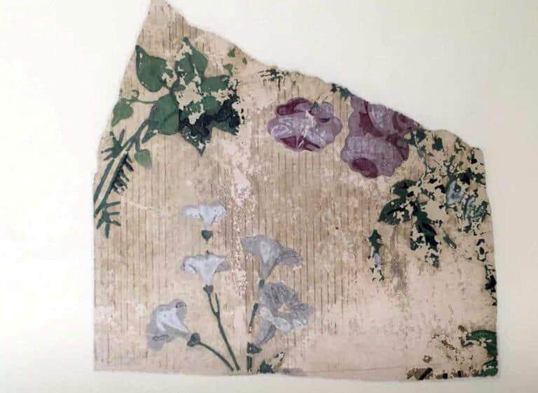
Victorian green wallpaper — this should accompany the “Green Was Poison” section. Scheele’s Green was developed in 1775 using copper arsenite and became popular in wallpaper because it was vivid, inexpensive, and relatively resistant to fading.
Arsenical greens became part of a much larger Victorian color story. Green pigments containing arsenic appeared in decorative products and other manufactured goods. Today, museums and libraries still identify and carefully handle historic objects colored with arsenic-based greens.
A related arsenical pigment, commonly called Paris Green or emerald green, had an especially strange second life. Beyond its use as a colorant, arsenic-based green compounds were also used as insecticides. The history of green therefore crosses art, design, chemistry, public health and agriculture.
ONE IMPORTANT DISTINCTION
Not every historic green was poisonous. Malachite, green earth, verdigris, Scheele’s Green and Paris Green are different pigments with different chemical compositions. The dramatic arsenic story belongs specifically to the arsenic-containing greens.
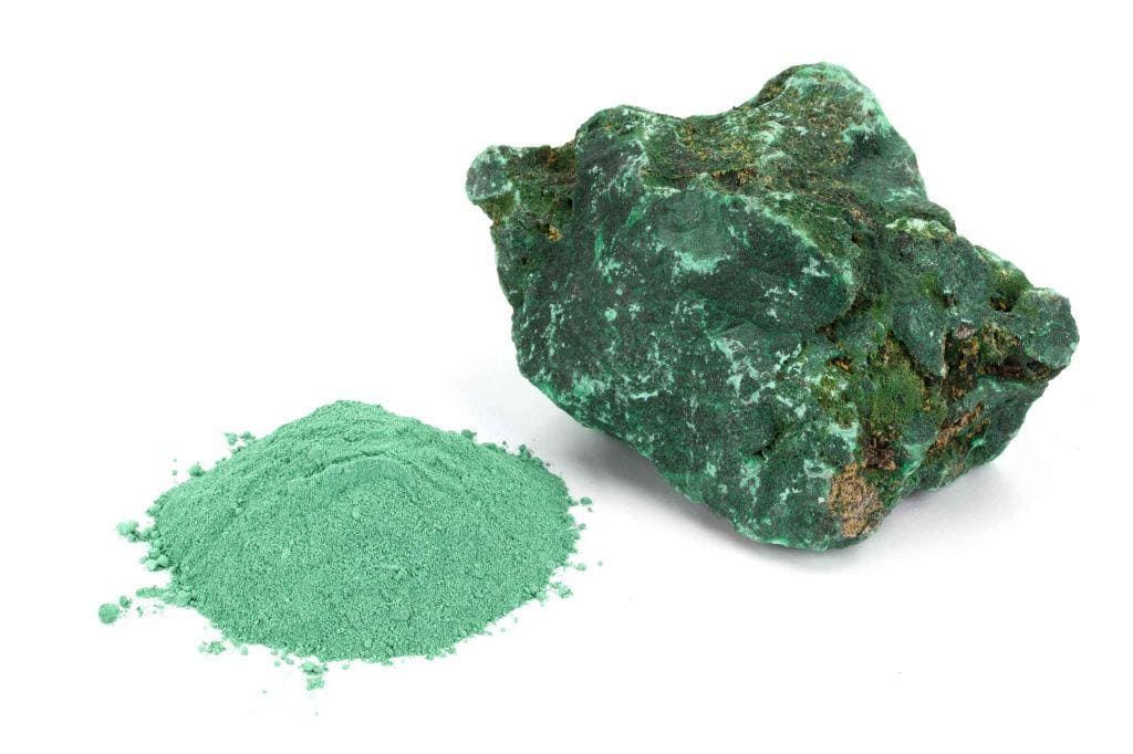
Malachite / early natural green — useful immediately before the poisonous-green story, because it establishes that not all historic greens were toxic. Natural earths and malachite were used as green pigments in antiquity.
The History of Blue and Green Colors in Today’s Pencil Box
Looking at the blues and greens scattered across my desk now, it’s easy to forget how extraordinary this would have seemed centuries ago.
I can move from turquoise to lime green, deep blue to seafoam simply by reaching for another pencil. Artists before us searched for minerals, traded materials across continents, experimented with chemistry and sometimes even worked with substances we now know were toxic.
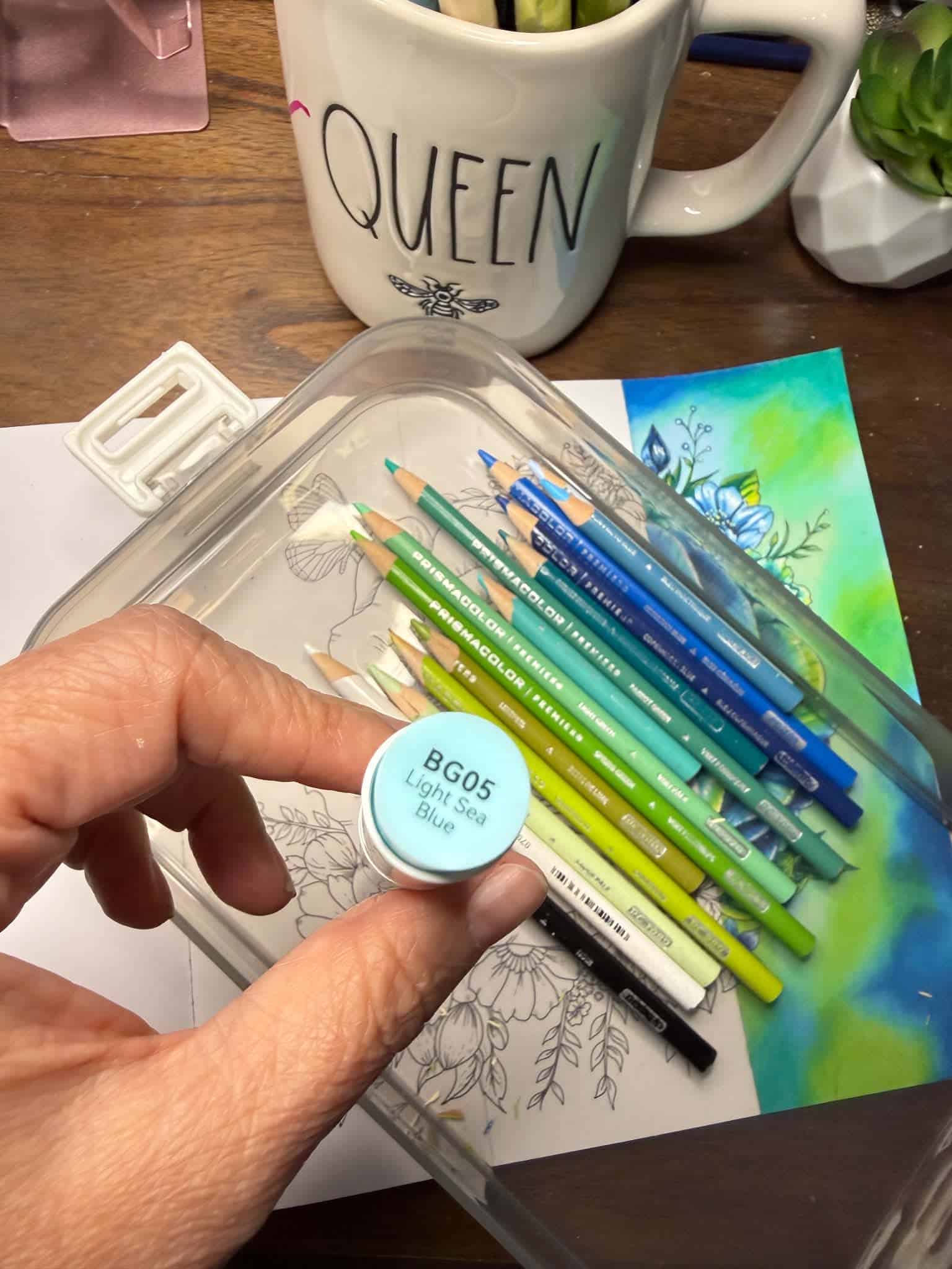
My modern blue-and-green palette — a very different experience from sourcing historic pigments.
WHY BLUE AND GREEN WORK SO BEAUTIFULLY TOGETHER
There is also a practical reason I love this combination for coloring. Blue and green sit next to each other on the color wheel, so they can create an analogous palette that feels naturally connected. But “harmonious” does not have to mean flat.
Deep navy and dark blue can create the strongest shadows and depth.
Turquoise and blue-green can act as a bridge between the two color families.
Fresh yellow-greens and lime tones can bring light and energy into the composition.
Pale seafoam, aqua and light blue can soften transitions.
Changing the value — how light or dark a color is — is what gives a limited palette dimension.
The history of blue and green colors shows just how closely art has always been connected to science, geography and trade.
NOW IS YOUR TURN!
Want to experiment with your own blue-and-green palette?
I’m sharing the A Rose Dream coloring page FREE, so you can download it, choose your favorite blues, teals and greens, and color along with me.
NOW LET’S COLOR!
Knowing the history doesn’t change how I use blue and green, but it does make me look at them differently. In this color-along, I use blues and greens to create depth, contrast and light in A Rose Dream from Blossomia.
SOURCES & FURTHER READING
- Harvard Gazette — “When Egyptians made blue” (2026). Egyptian blue as the earliest synthetic pigment, around 3100 BCE, and modern pigment research. Source
- The National Gallery, London — “A history of the colour blue in art.” Natural ultramarine, lapis lazuli, Afghanistan, and the origin of the name ultramarine. Source
- Cooper Hewitt, Smithsonian Design Museum — “Toxic Beauty.” Scheele’s 1775 arsenic-containing green and its use in nineteenth-century wallpaper. Source
- Maryland Center for History and Culture — “An Update on Arsenic Green.” Background on Scheele’s Green and arsenical color history. Source
- WebExhibits — “Pigments through the Ages: Intro to the Greens.” Historical overview of green earth, malachite and verdigris. Source
- Encyclopedic background on synthetic ultramarine: Guimet’s process in the 1820s and Gmelin’s published process in 1828. Source

Follow me on social media for more updates and to be part of this vibrant coloring community!